Projet précédent

Eider
Visual Identity
Fidroit
Brand identity for a wealth management major player.

2018–2019
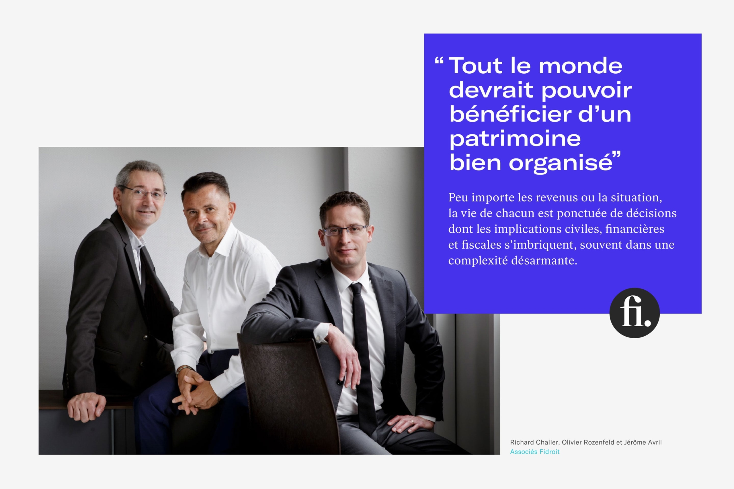
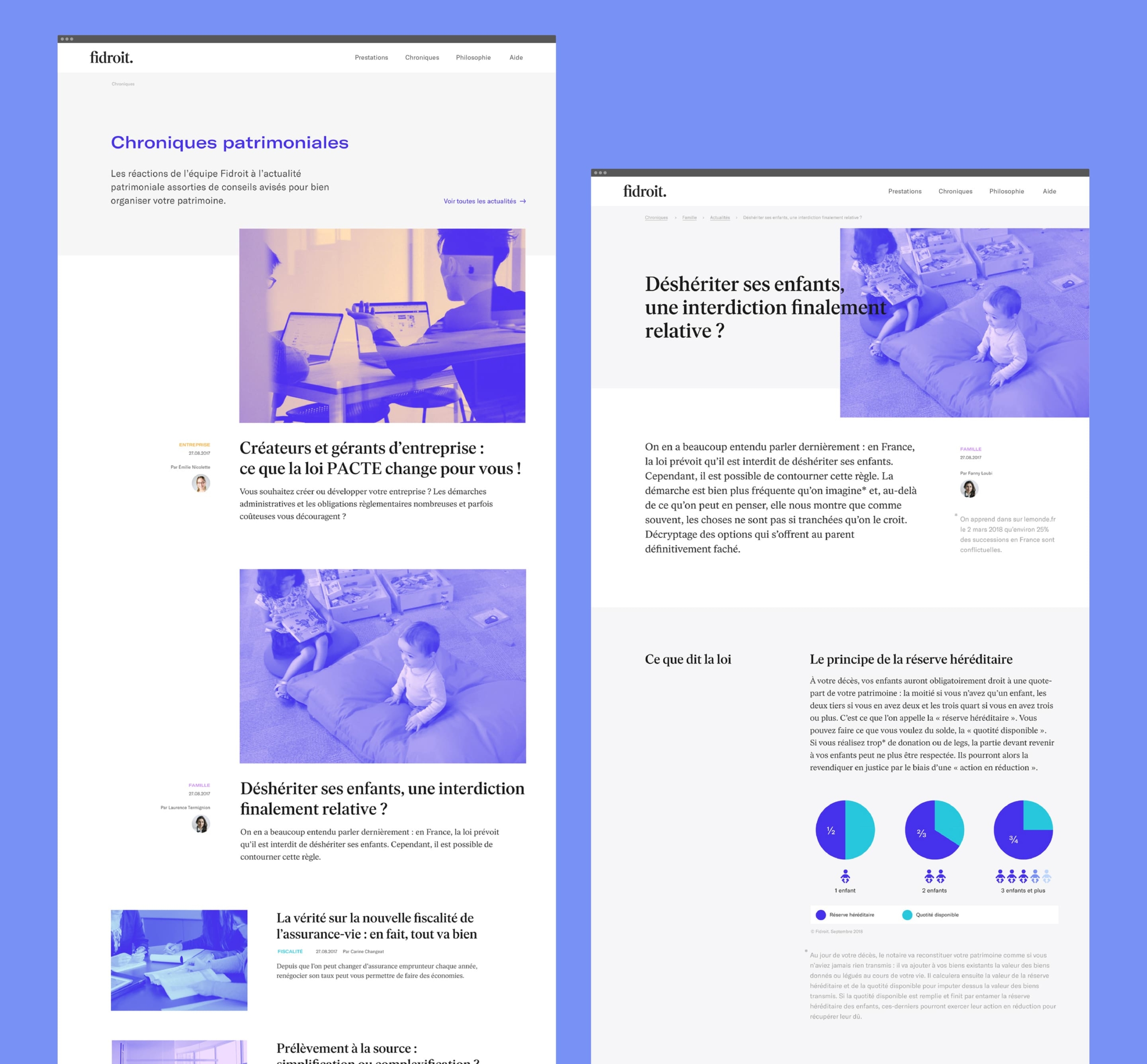
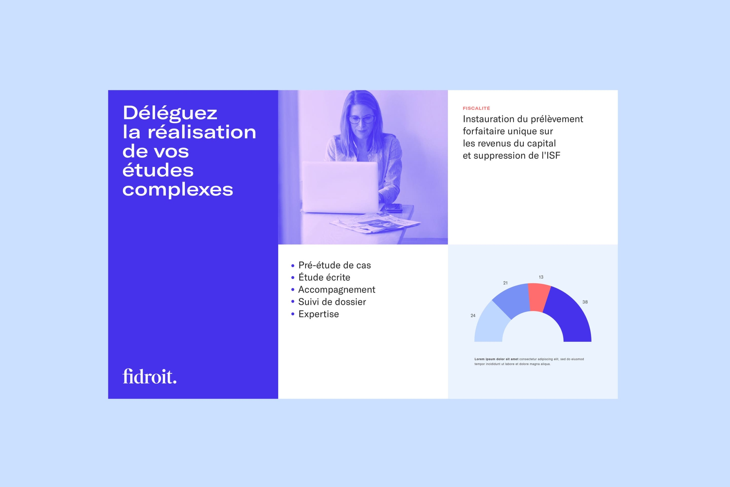
Fidroit has been working for 20 years to enable everyone to organize and manage their assets in a fair and virtuous way. We have developed an identity that reflects the integrity, rigor and kindness of the brand and distinguishes its historical business support of wealth management professionals and more recently, the advice to the general public.
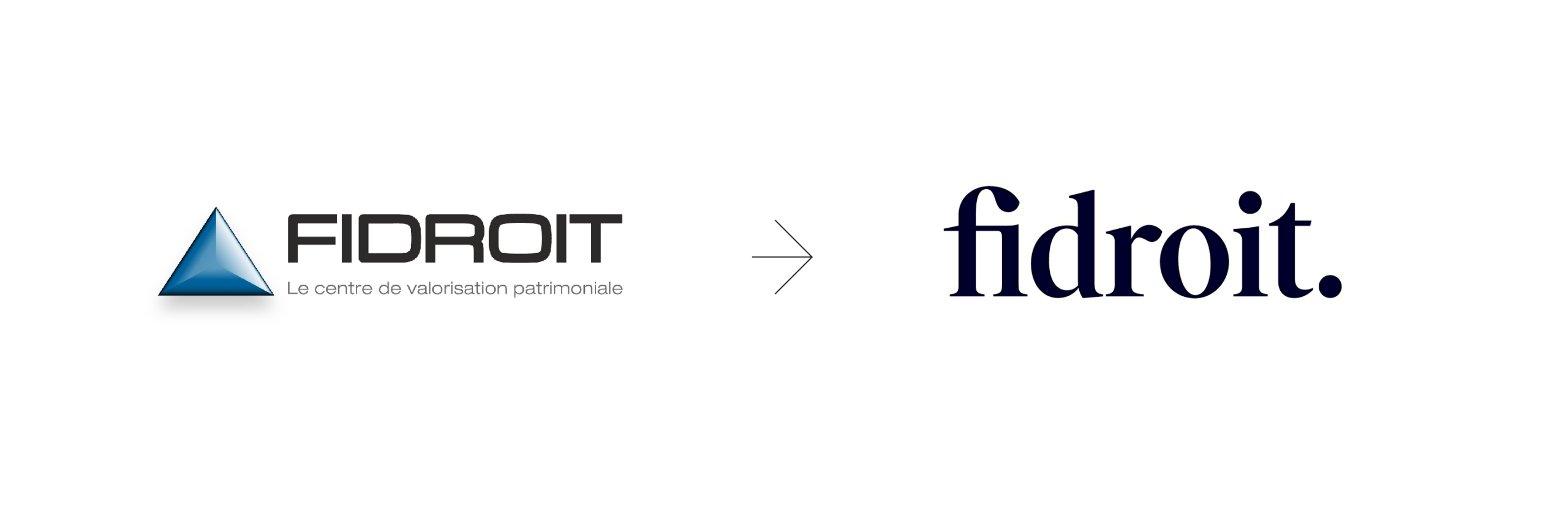
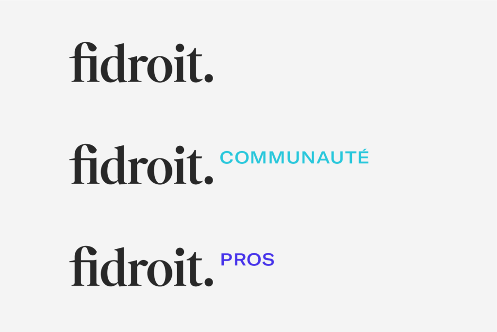
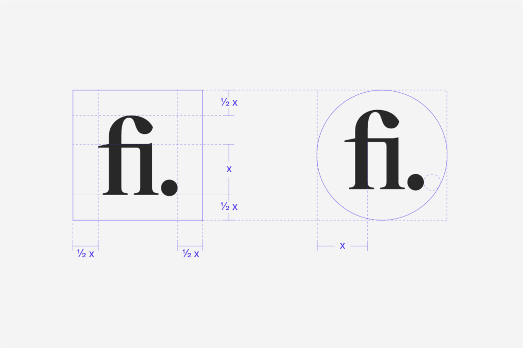
The logo borrows from the register of writing and affirms the link of the brand with legal text. Its variations allow the identification of Fidroit different trades while maintaining a uniform and simple expression of the brand.

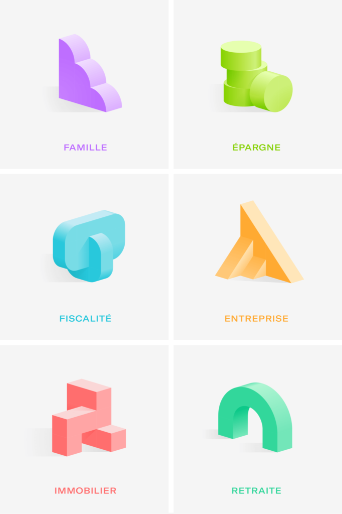
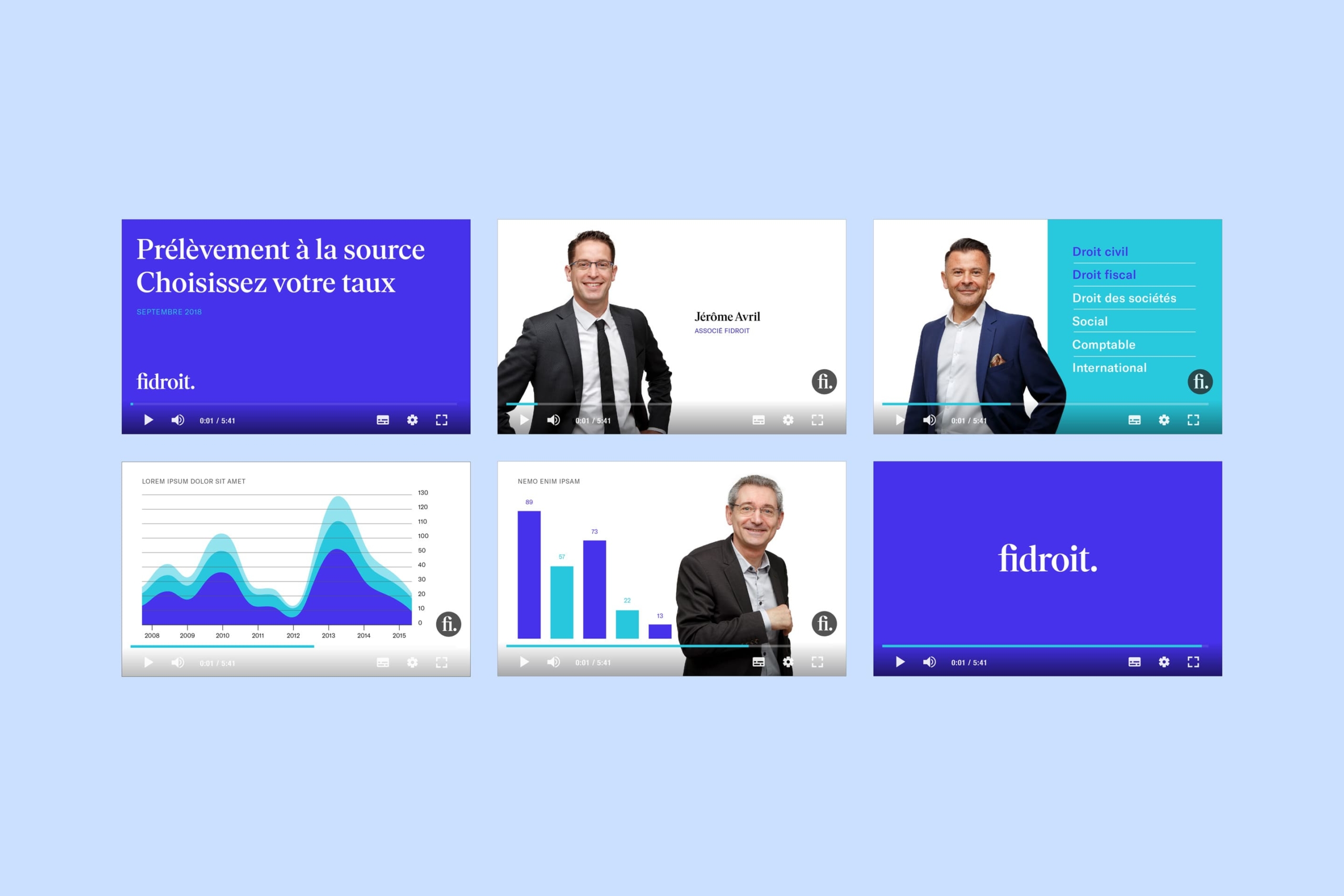
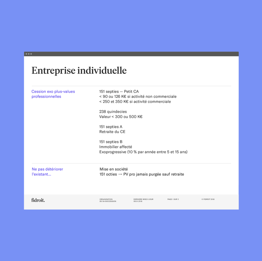
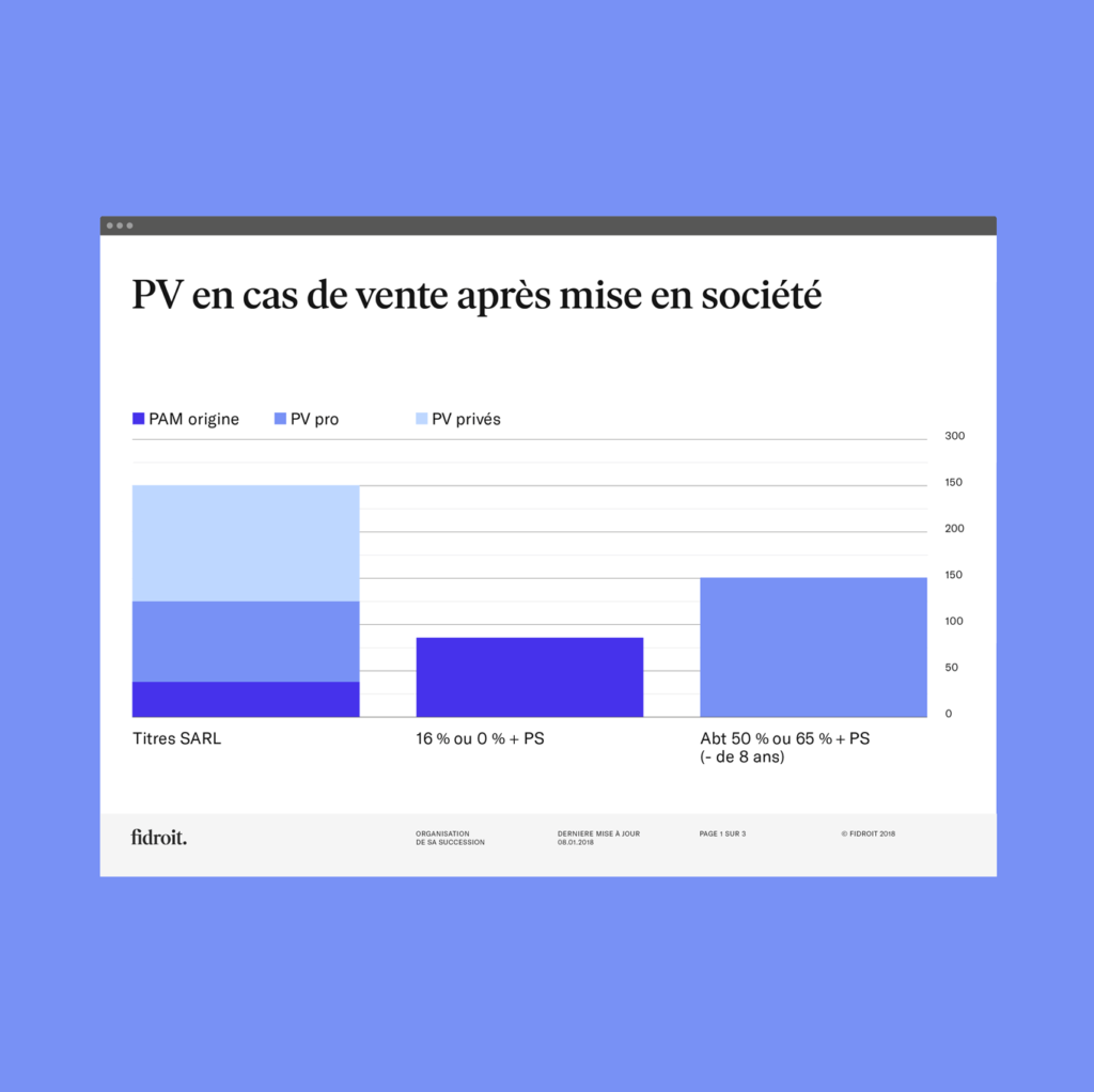
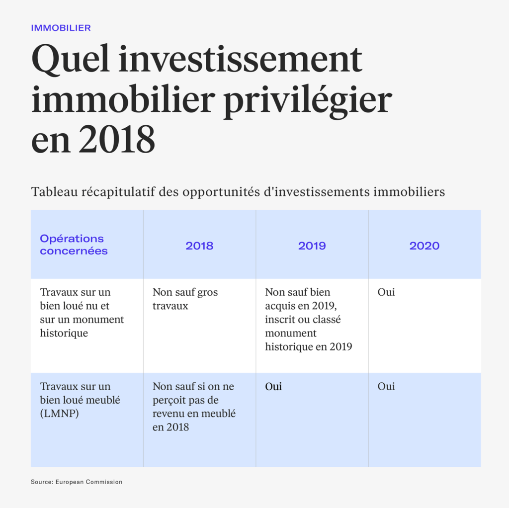
Composed of basic forms, the illustrations makes the complex and often abstract idea of heritage more tangible and accessible. According to the profile of its clients, Fidroit builds adapted, robust and consistent wealth management strategies.
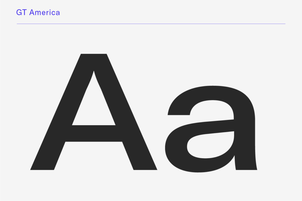
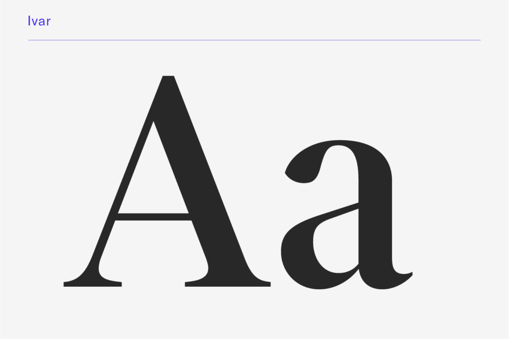
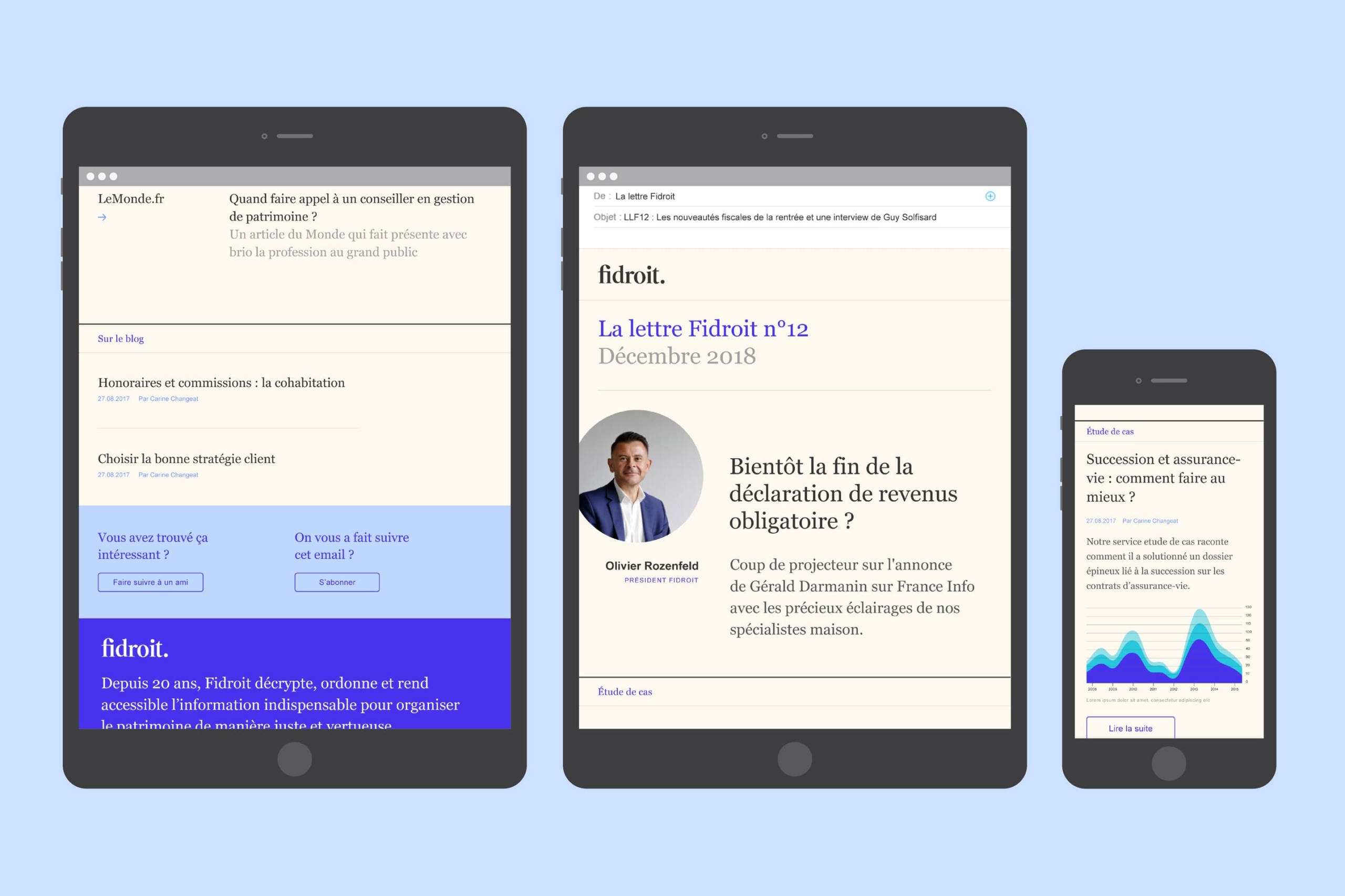
Two typefaces distinguish the two levels of brand speech: a generous lineal for marketing speech and a statutory serif for the expert’s speech.
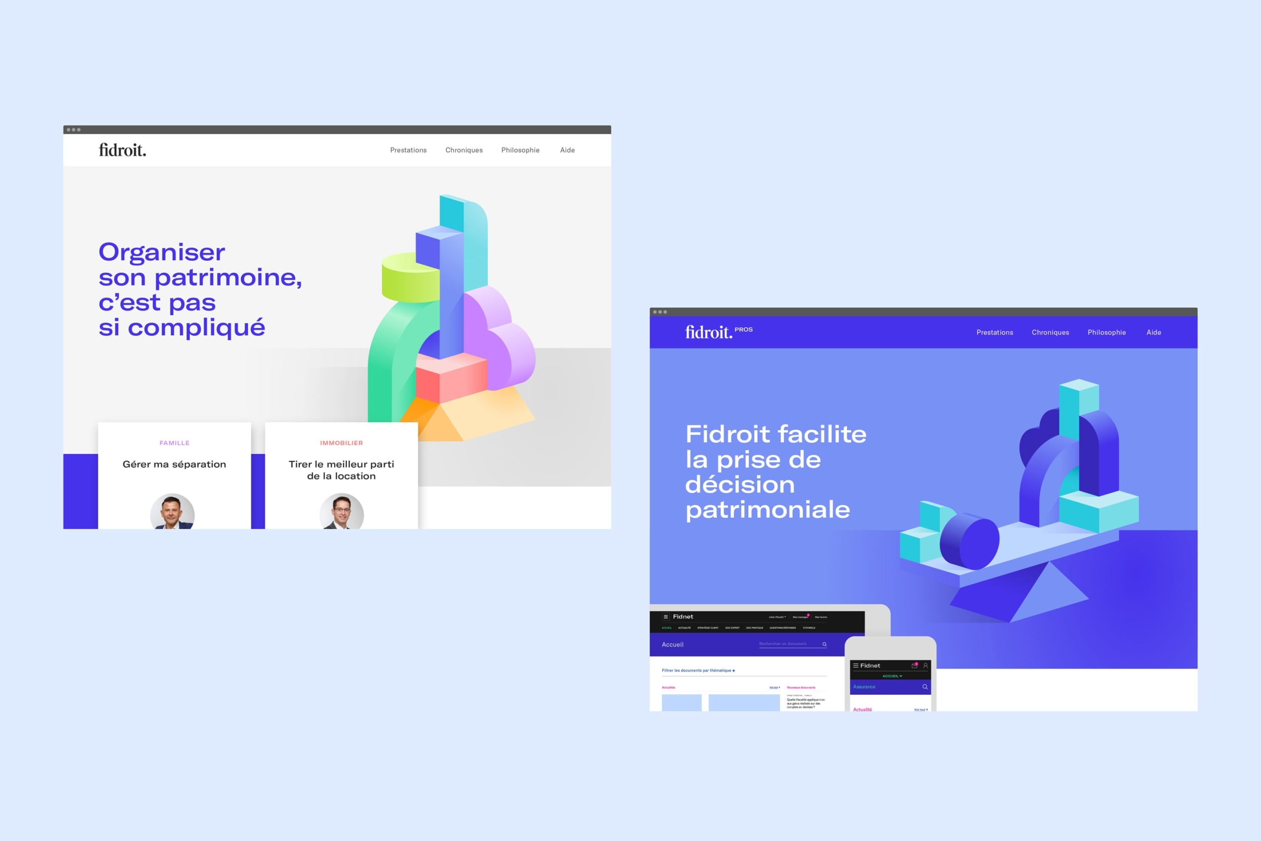
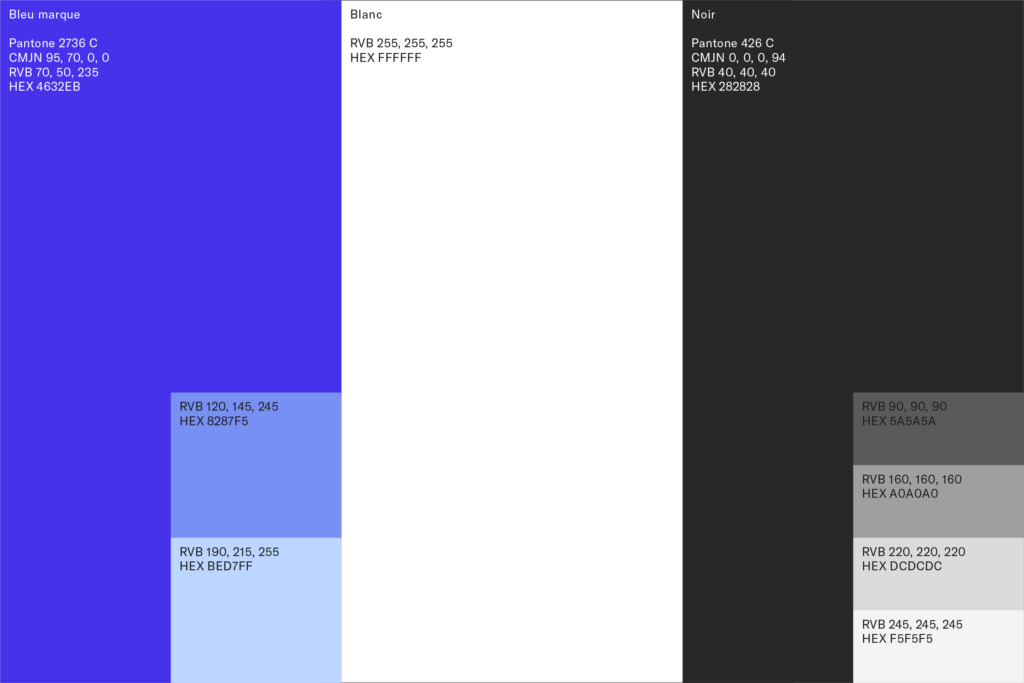
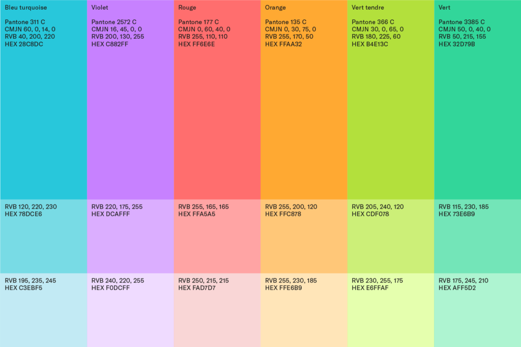
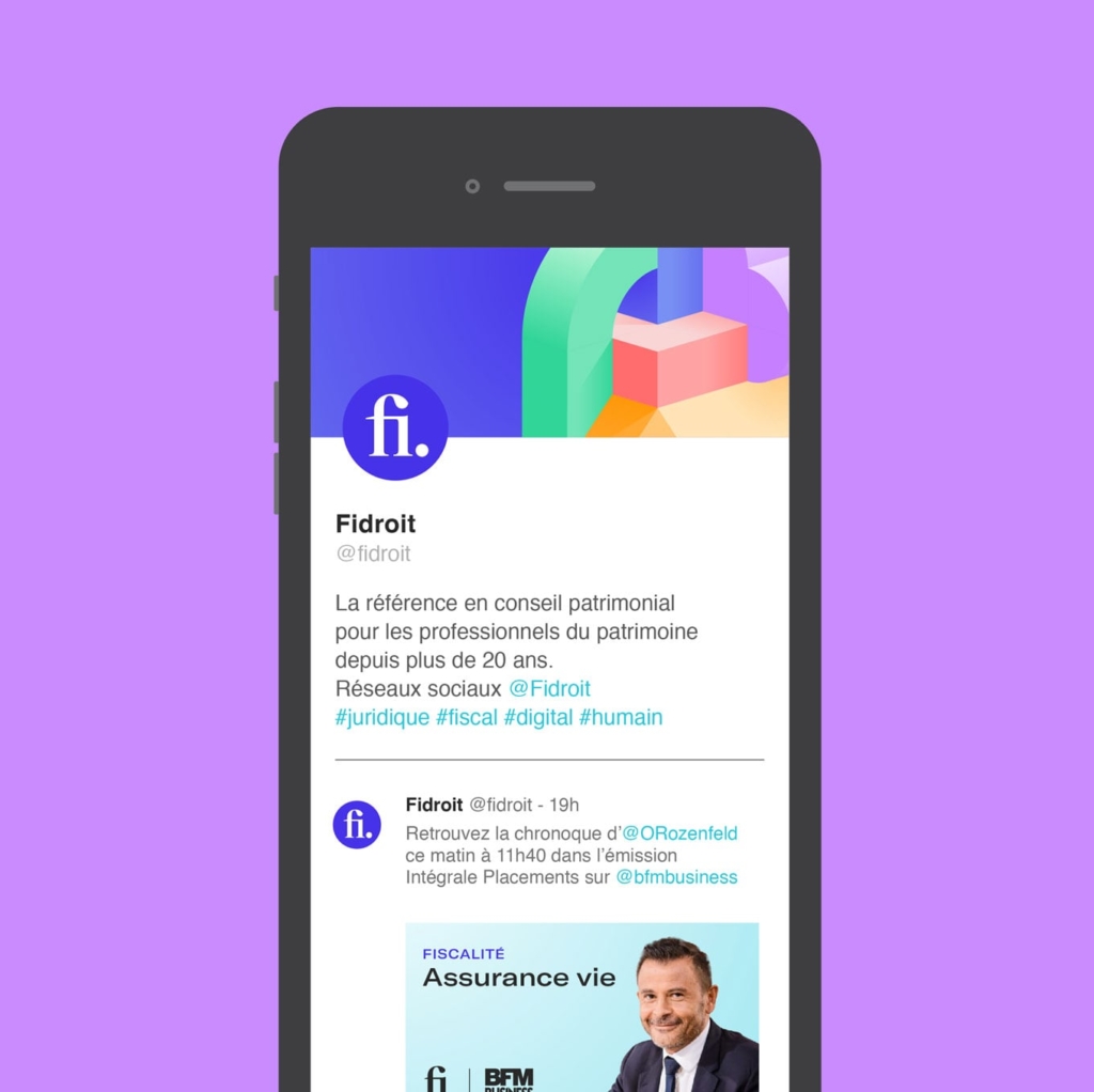
The transverse use of the Fidroit blue maintains the integrity of the brand, whether for individuals or professionals.

Credits
Information architecture, copywriting: Olivier Talbot
Digital Strategy, Web Development: Ultro
Photography: Ludovic Combe
Typefaces: Ivar Display, GT America