
Eider
Proposal For a Rebranding.
2016
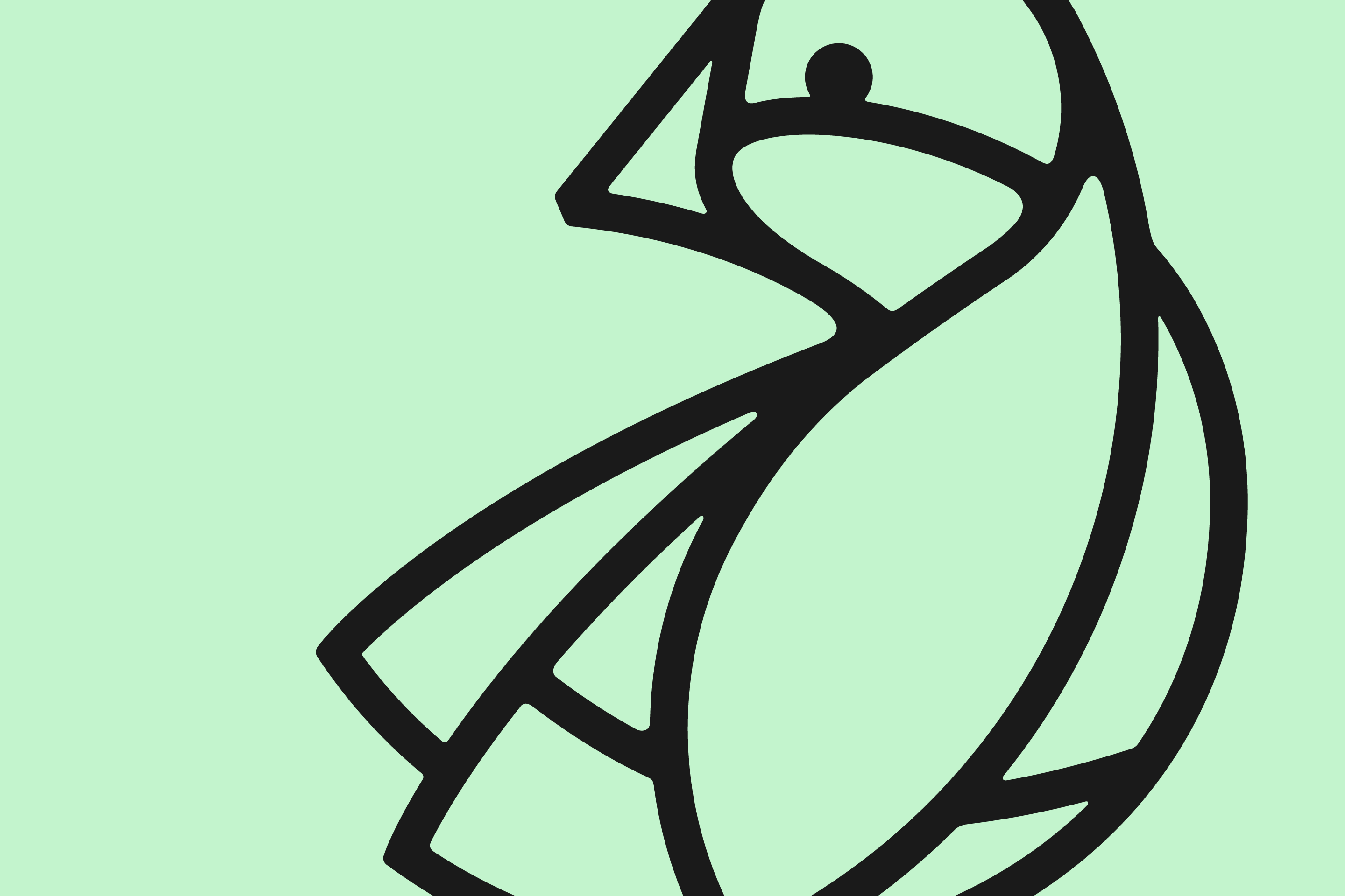
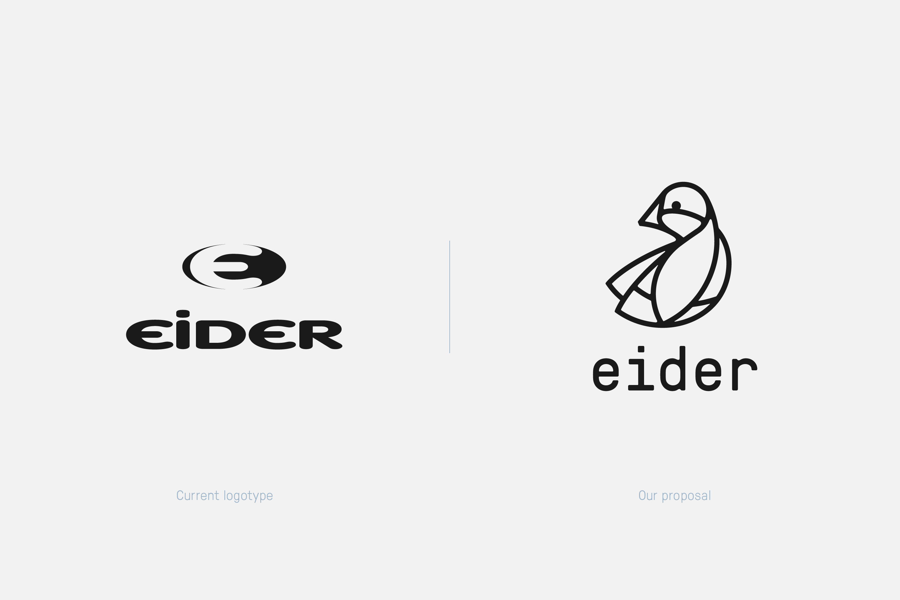
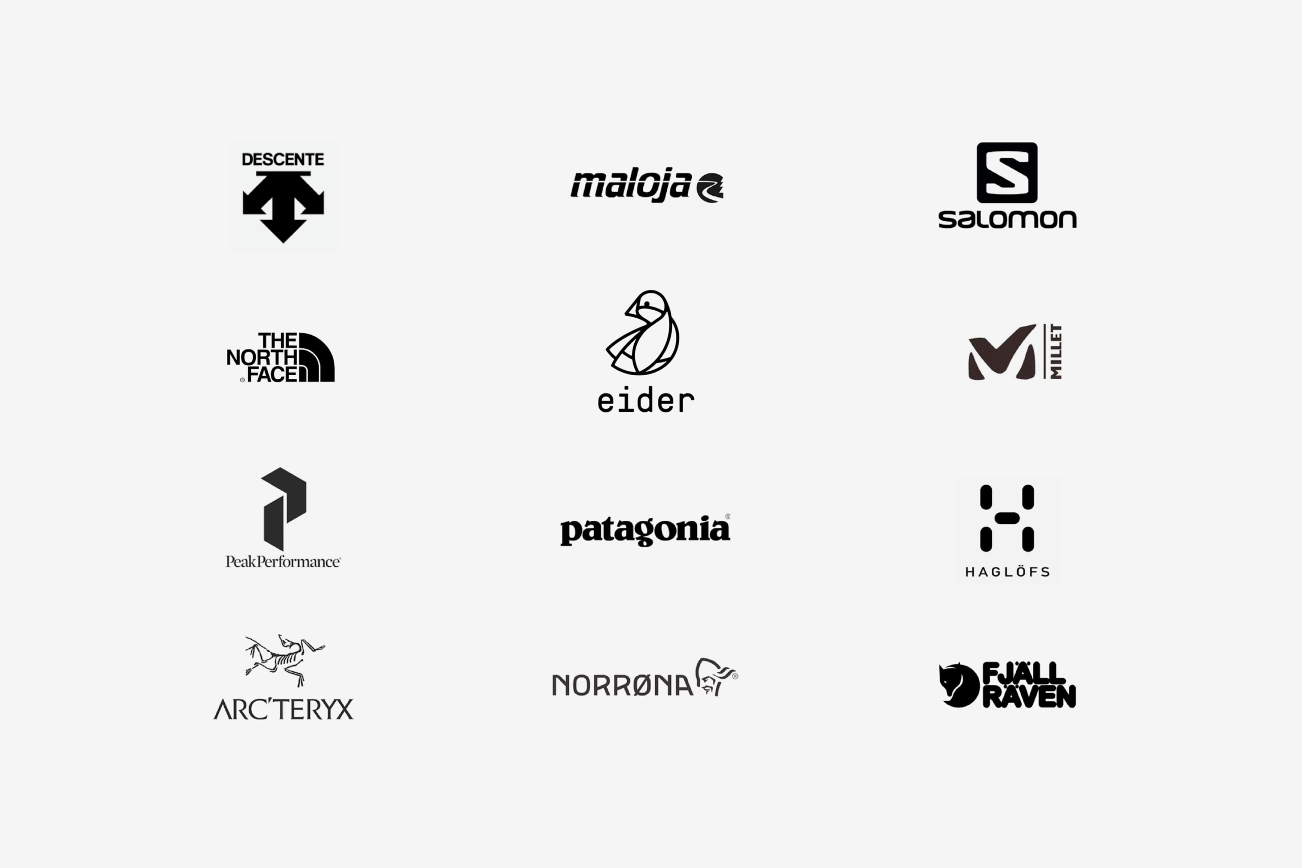
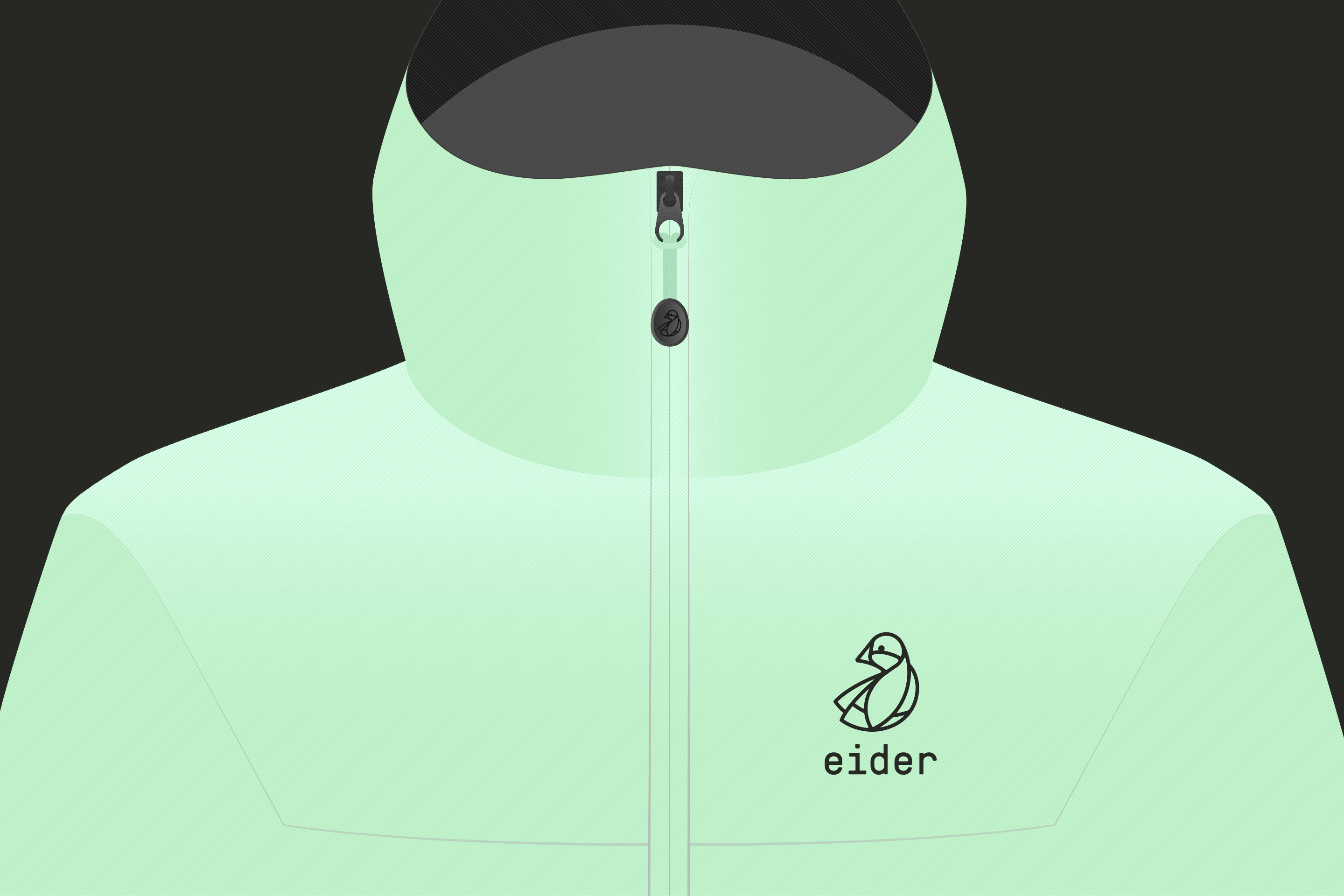
We have been asked to redesigned a new version of Eider’s logo that could reflect the new brand positioning. Our proposal literally interprets the eider name that reflect warmth, precision and sincerity that characterizes the brand: [aɪ.dər] large bird belonging to the duck genus, living on the shores of northern Europe and very popular for its down used to fill the bed duvets.
N.B. This rebranding project was finally abandoned.
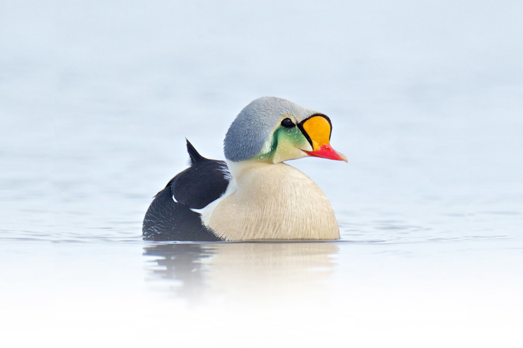
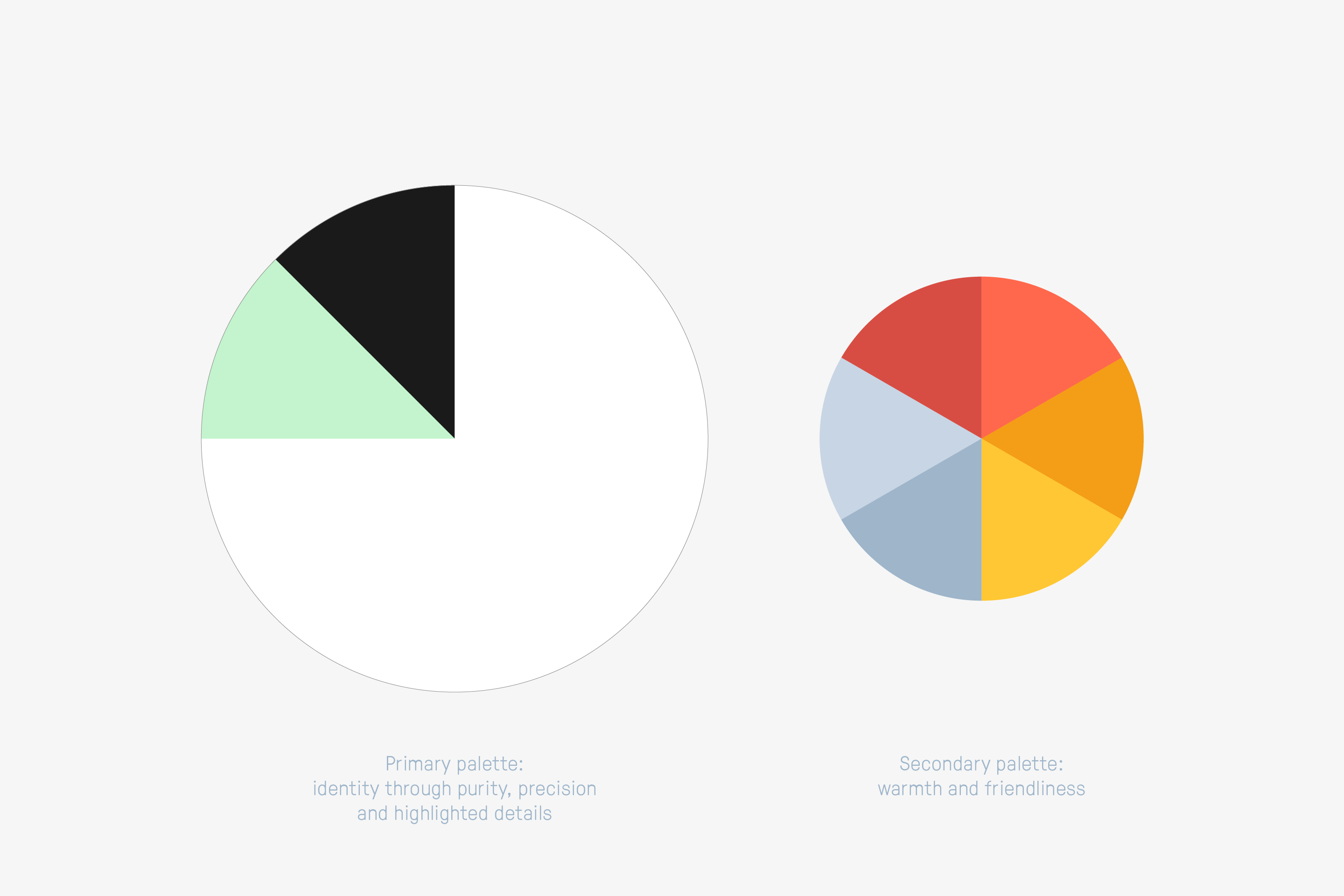
The eider duck naturally stands out as a symbol for the brand: living in arctic latitudes protected by its fluff, it is an obvious allegory of protective clothing. The color palette borrows its shades from the graceful bird too.
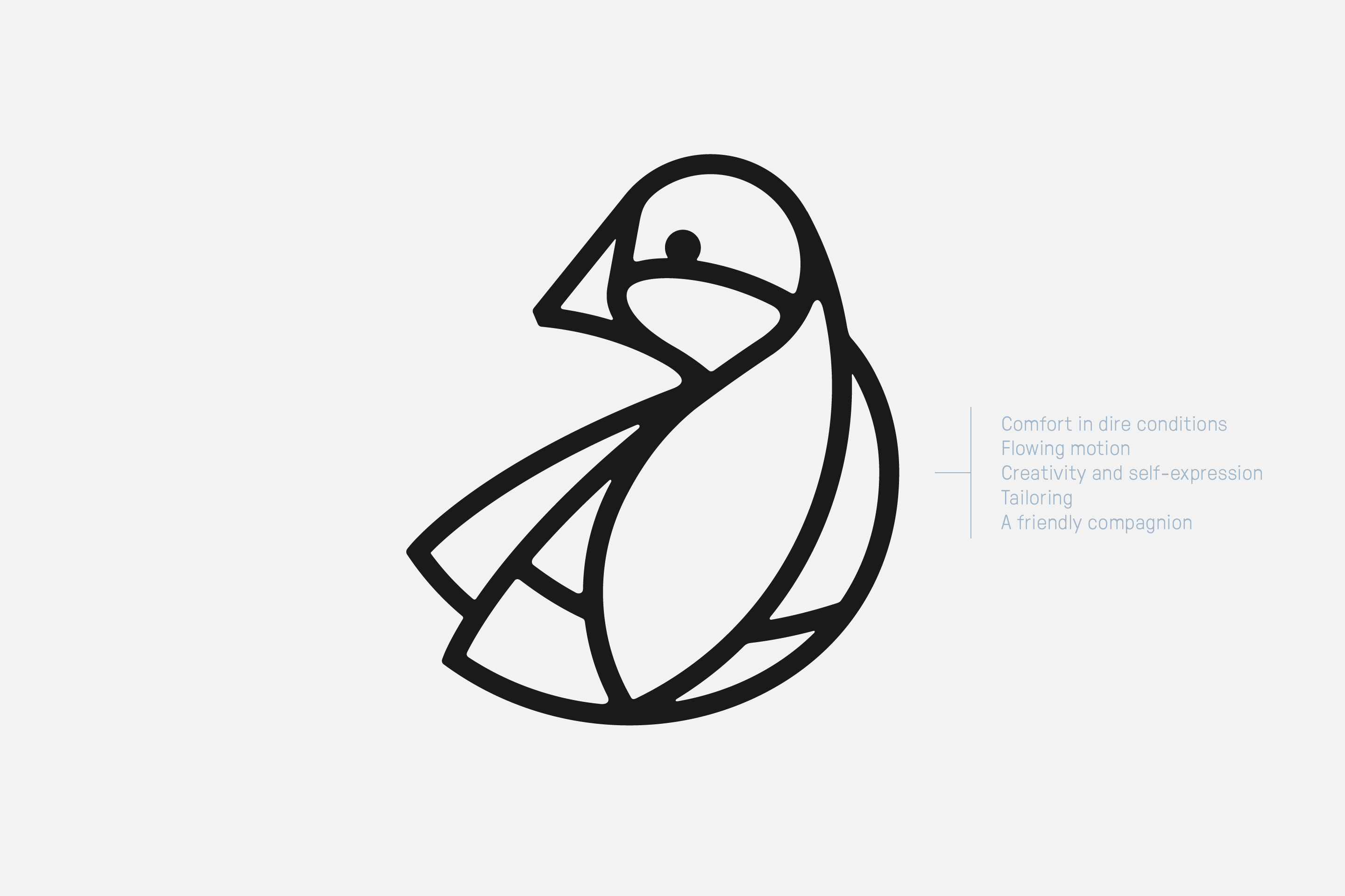
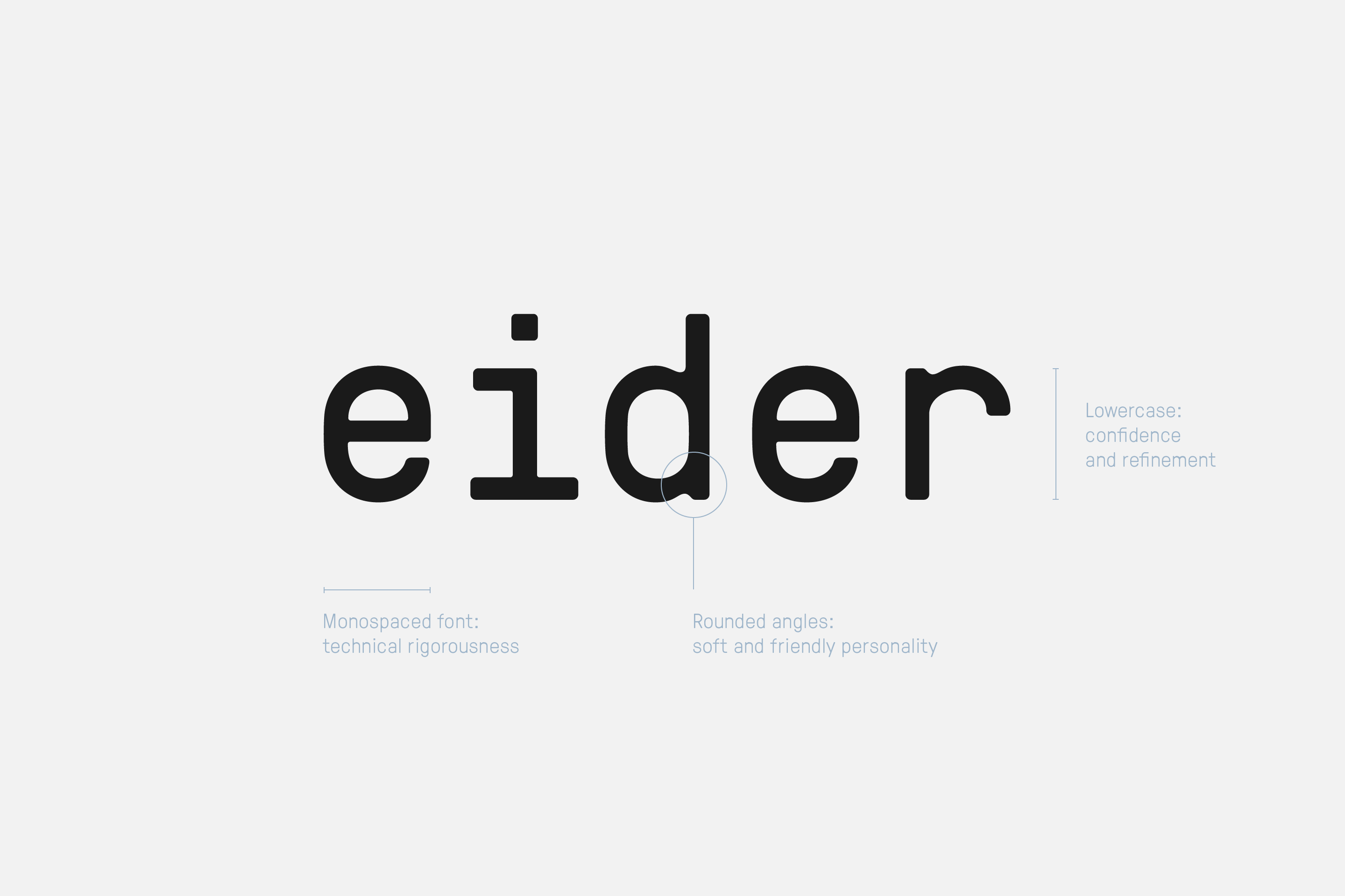
The logo suggest the brand’s DNA through underlying tensions: Nature – Engineering, Inspiration – Know-How, Creativity – Rationality.

Credits
Photography: courtesy of Stef Candé
Typeface: GT Pressura Mono

