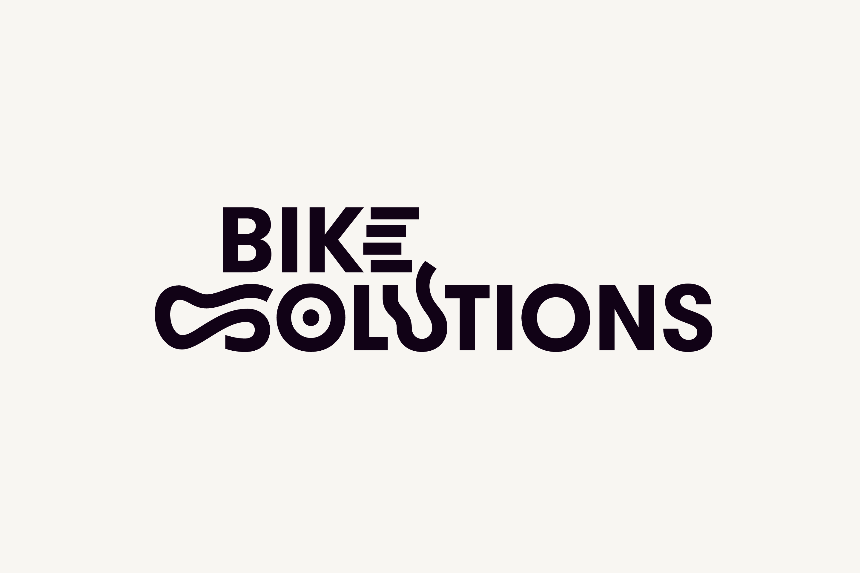
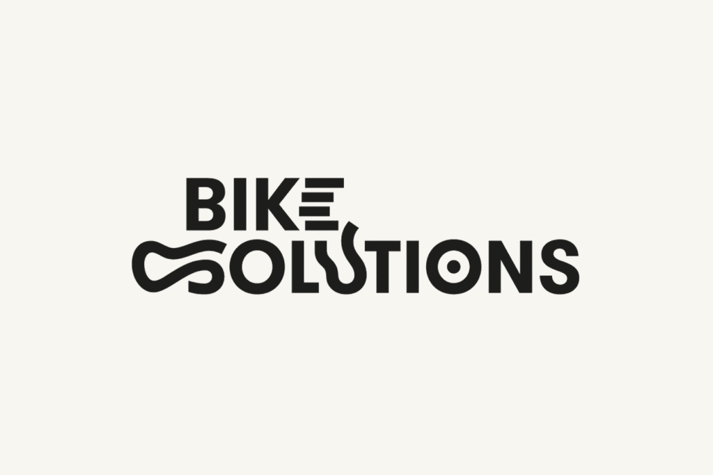
Bike Solutions

Brand design for biking trail designers.

2016–2017

In 10 years, Bike Solutions has established itself as a central player in the design and development of cycling area with an approach both original and respectful of the environment. The identity reflects the demanding and playful personality of the brand in its achievements and positions it as a reference in its field.

The logo integrates random signs inspired by the universe of cycling: bikes, topography, nature, paths.

Three ways to navigate between various projects are proposed on the website: a complete index of the trails, a selection of the best ones and a topographic map.

The photographs cast an objective eye over the achievements. They illustrate how the trails adapts to the landscape and how great is the pleasure to explore them. The text underlines, if necessary, the issues at stake.

The odd touches of a particularly dissonant pink color in the natural environment reflect the imprint of the brand on the landscape.

Credits

Information architecture: Olivier Talbot
Photography: Bike Solutions, Stef Candé, Silence
Web development: Go On Web
Typeface: GT Walsheim
Letterpress: Bouquet Crozat