Bertrand Bosc
Brand design for a relaxed wine guide.
2018
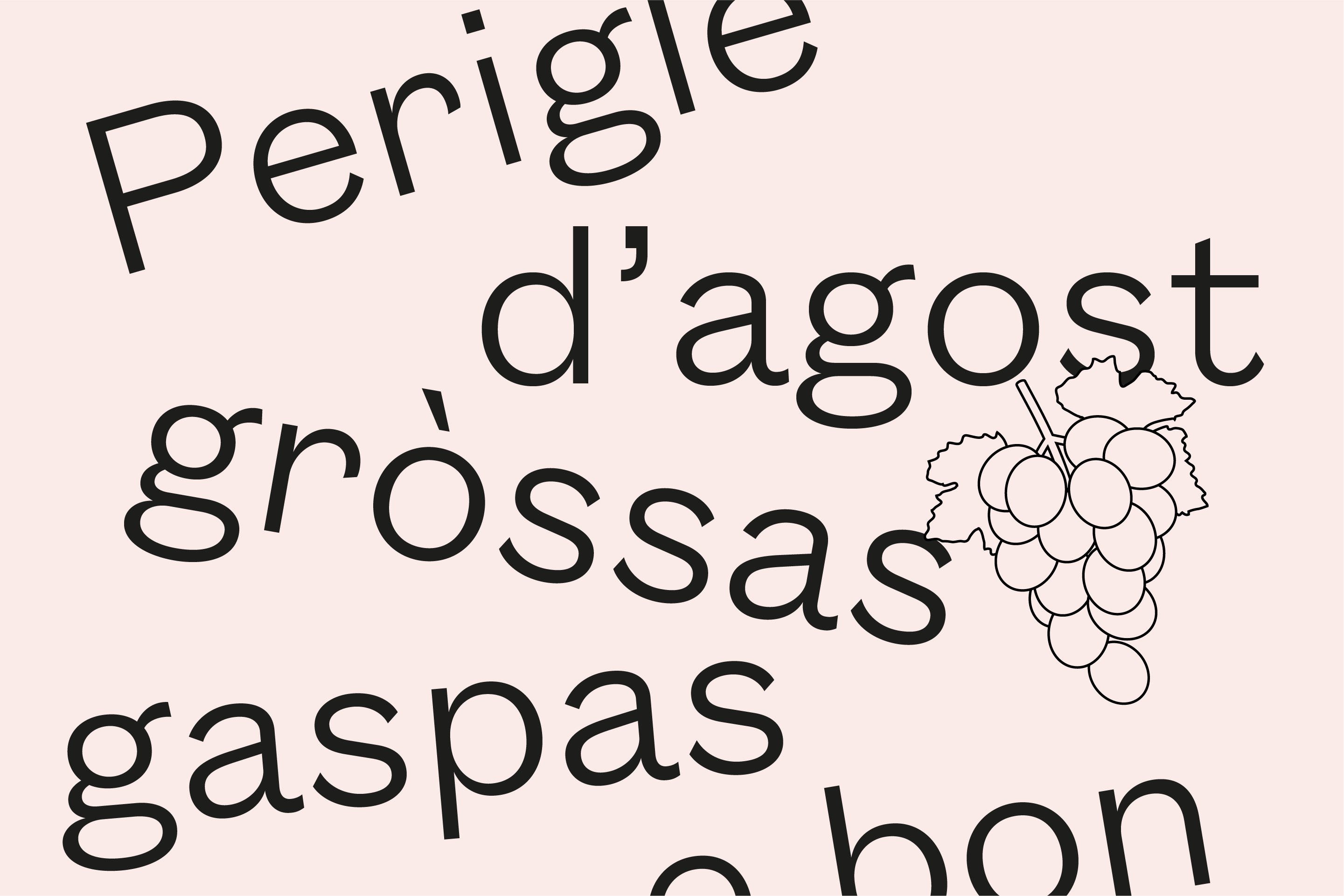
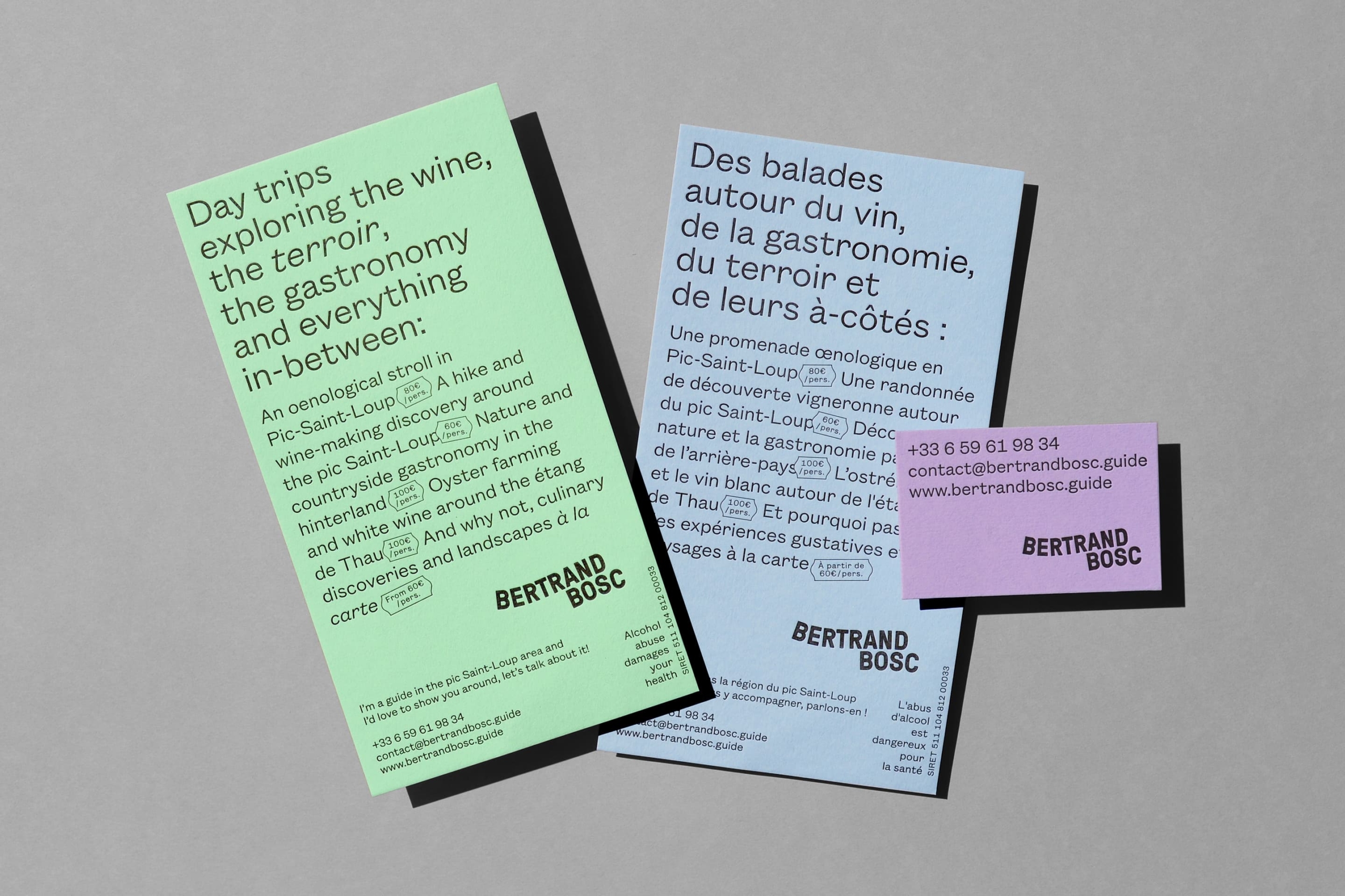
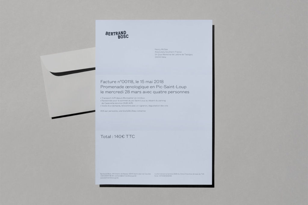
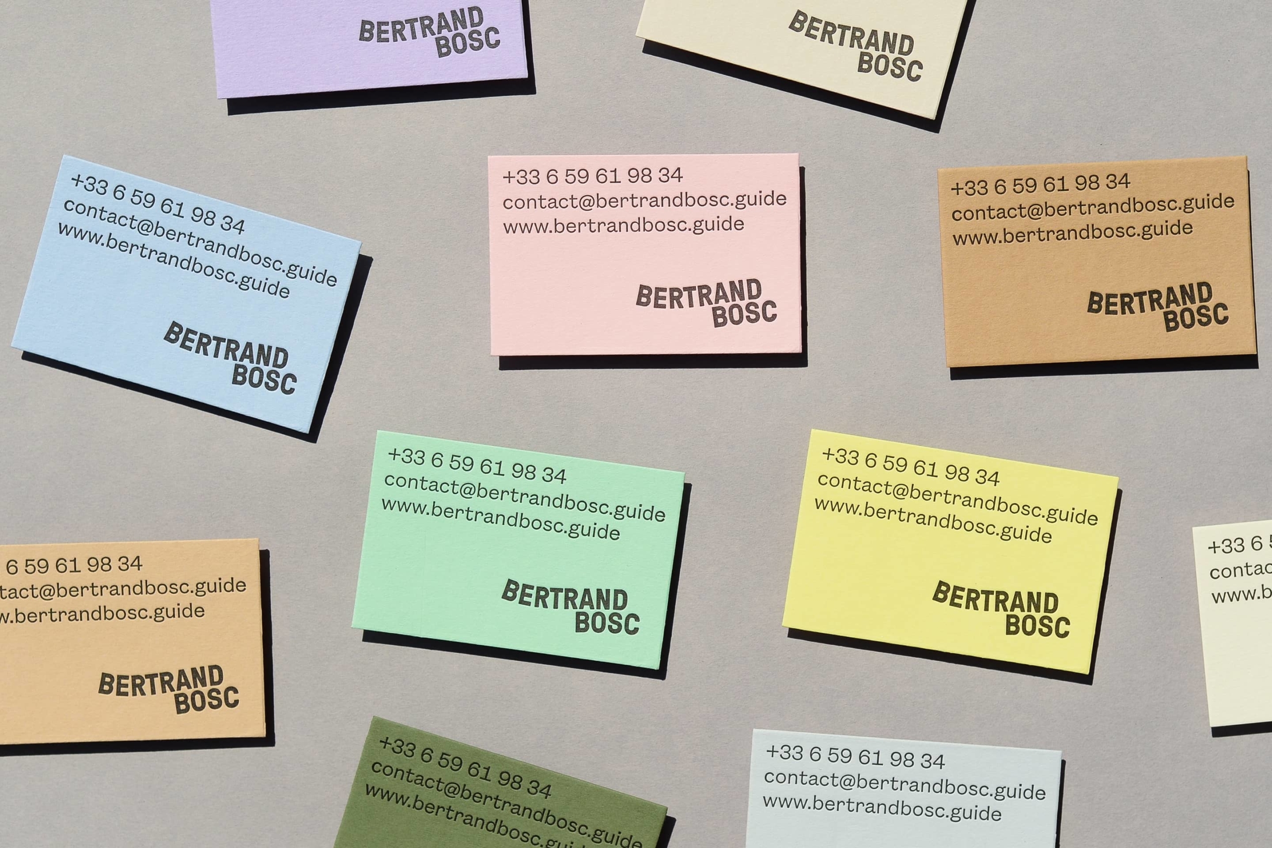
The walks Bertrand Bosc proposes offer warm and relaxing moments. To consolidate his status as a reference guide in the Montpellier region, we have created an unfussy brand identity, which reflects the character’s good nature and his benevolent approach to the profession of guide.
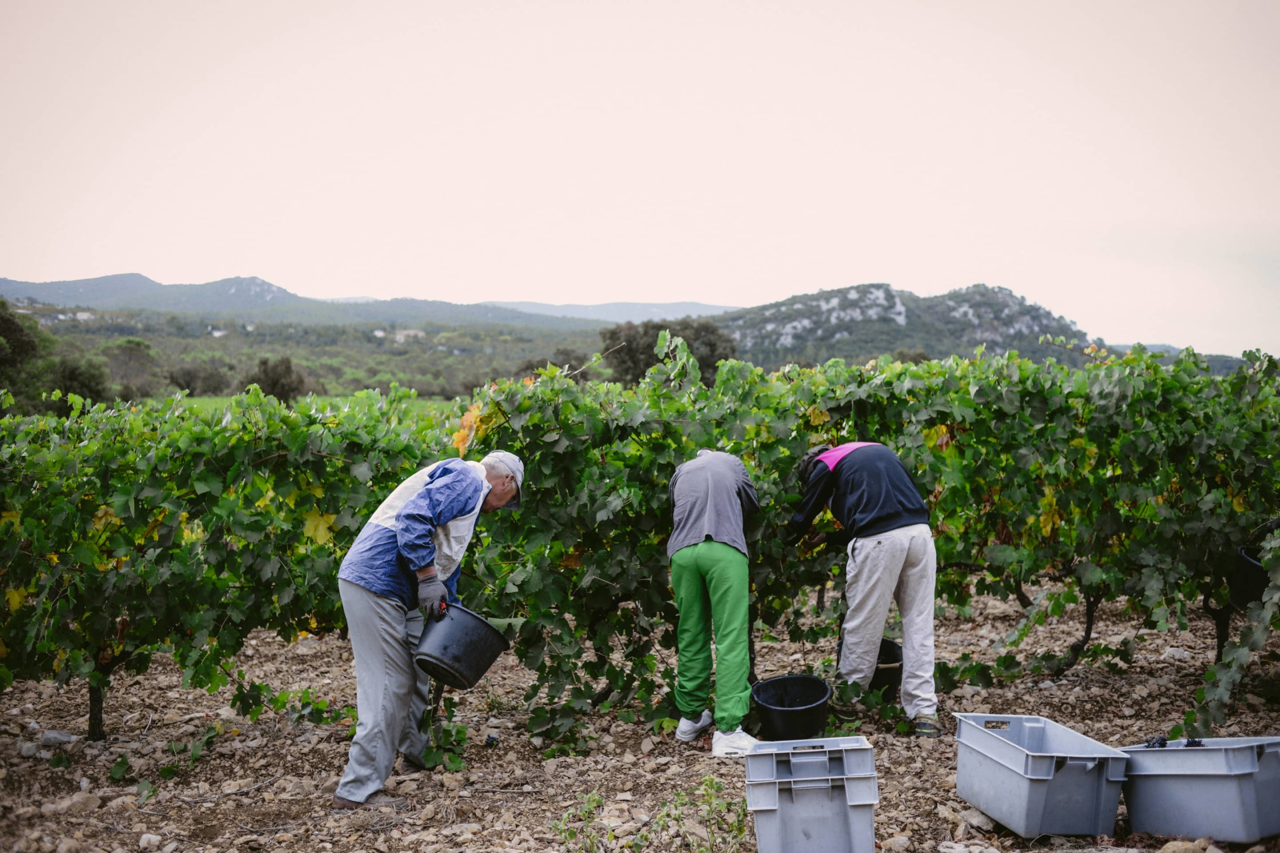
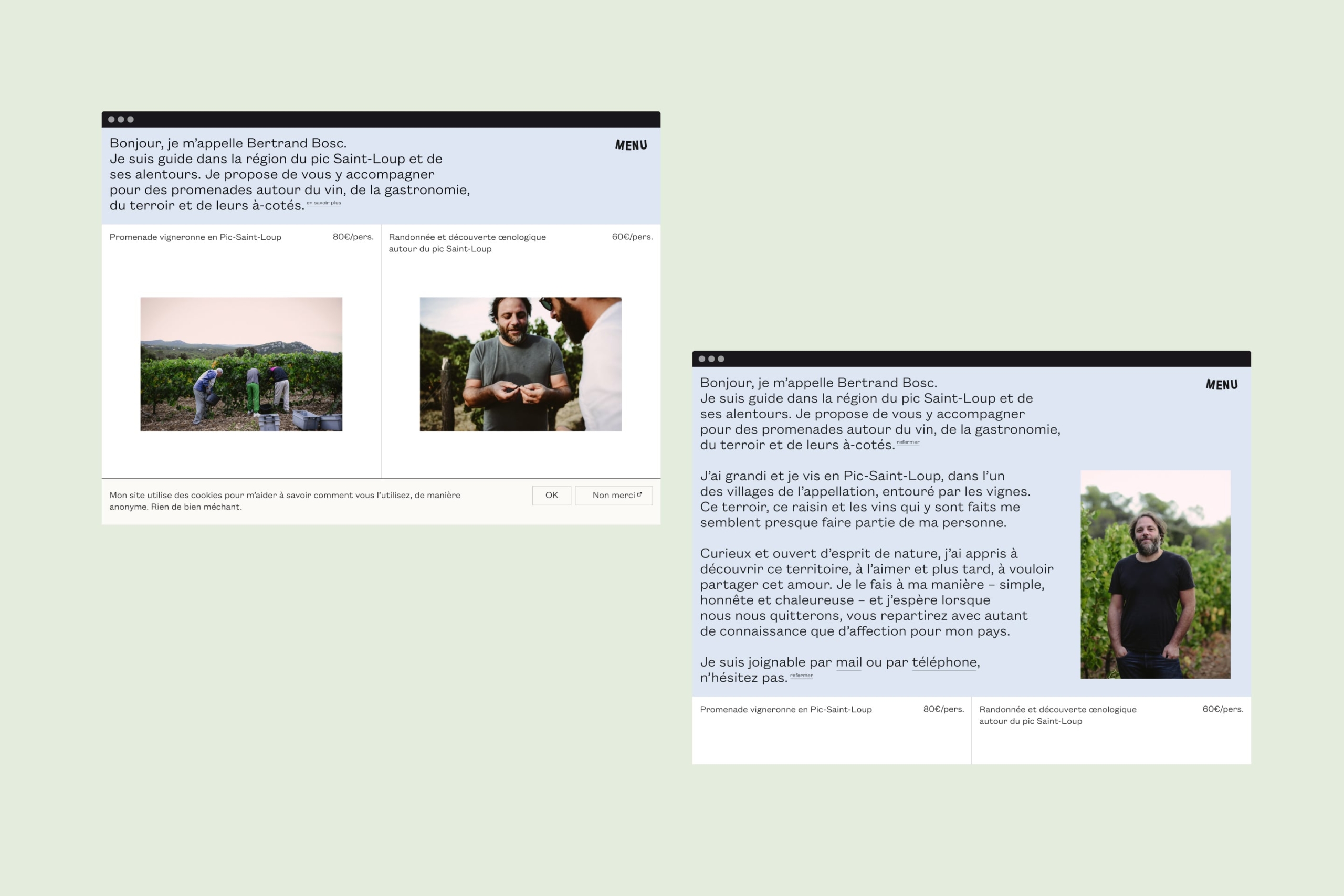

The photographs present a calm and spontaneous aspect while the text shows both good-humour and careful attention to details, like the guide himself.
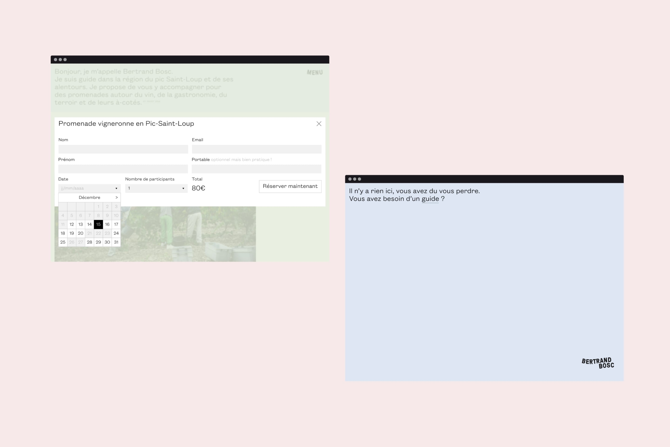
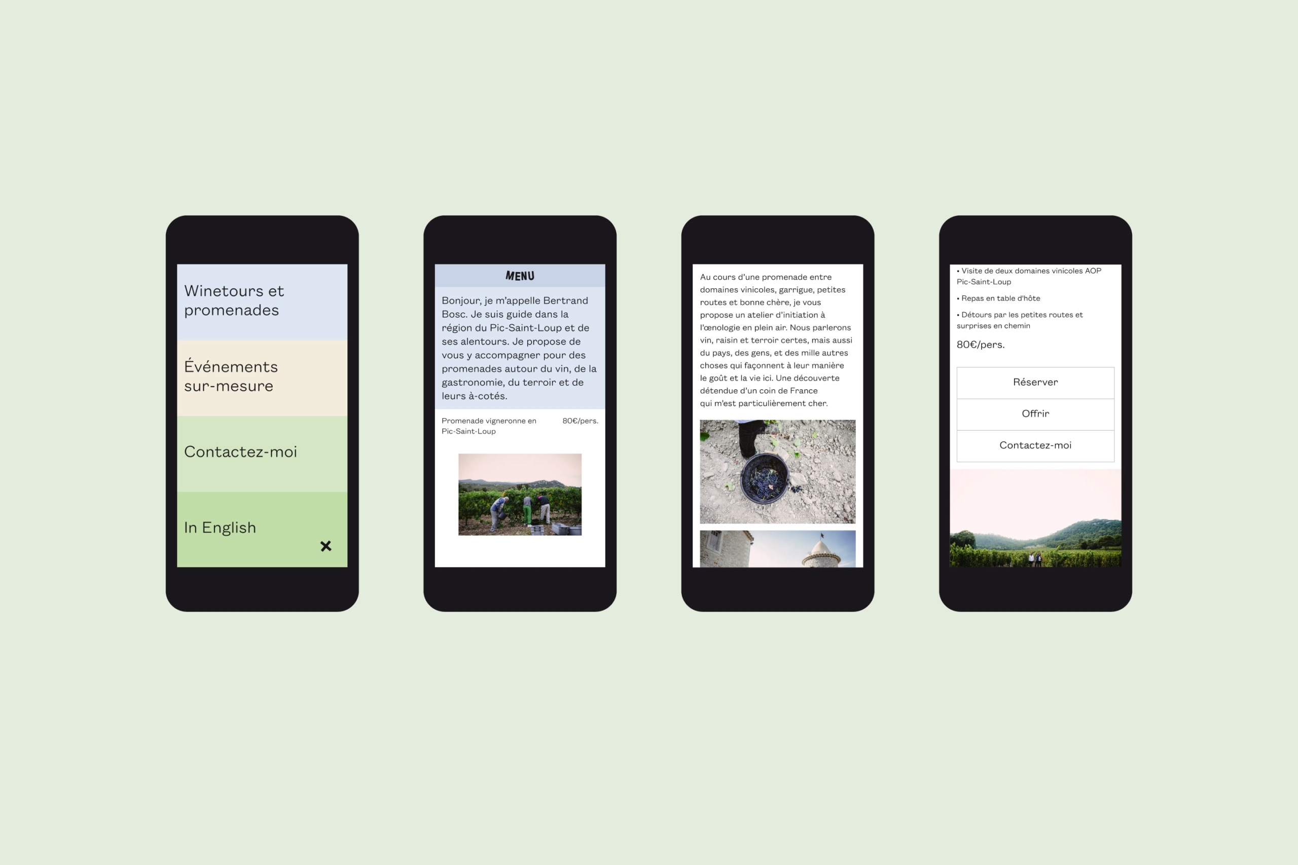

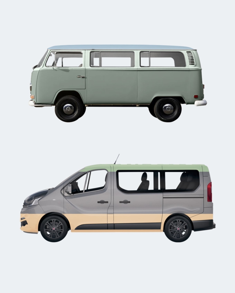
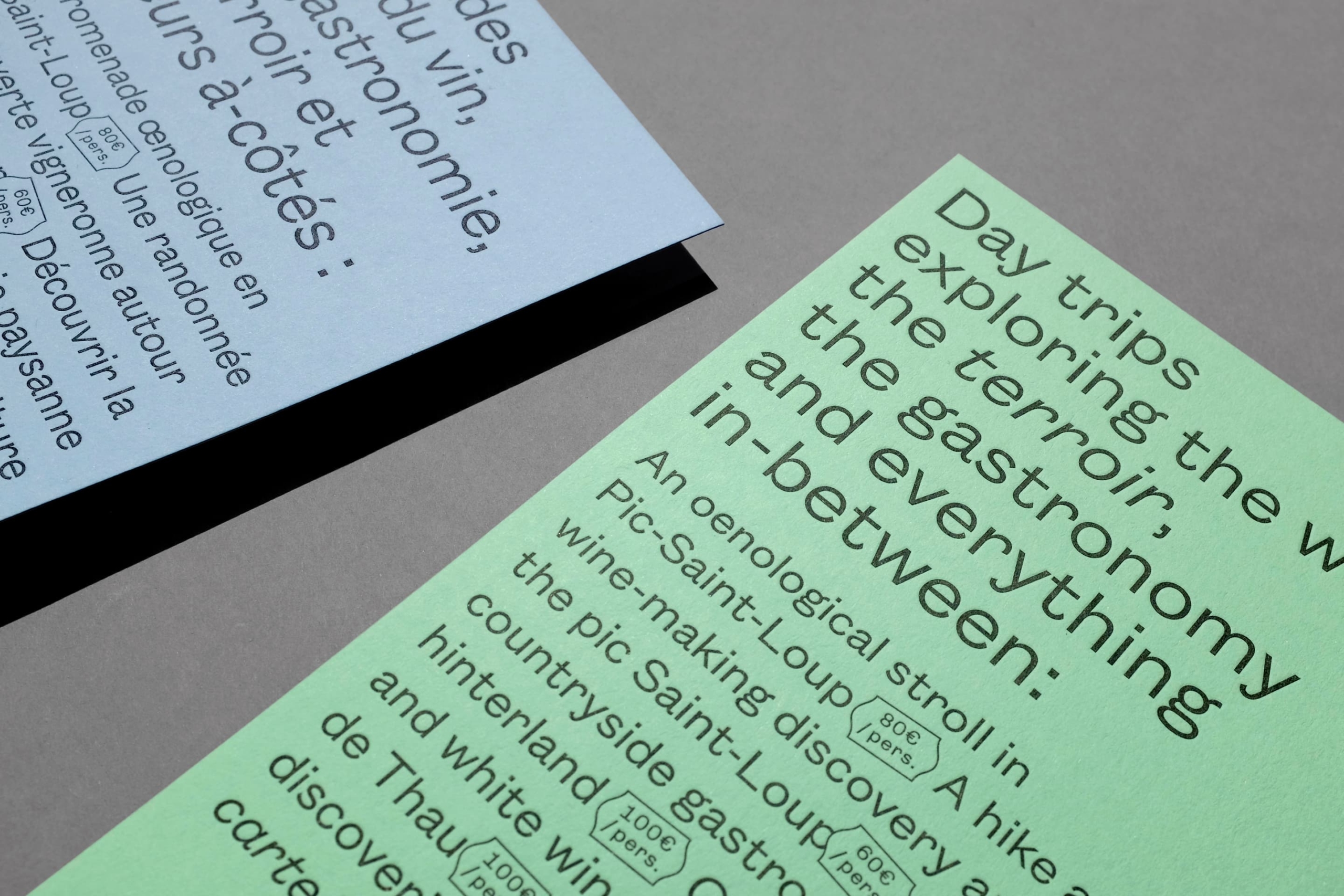
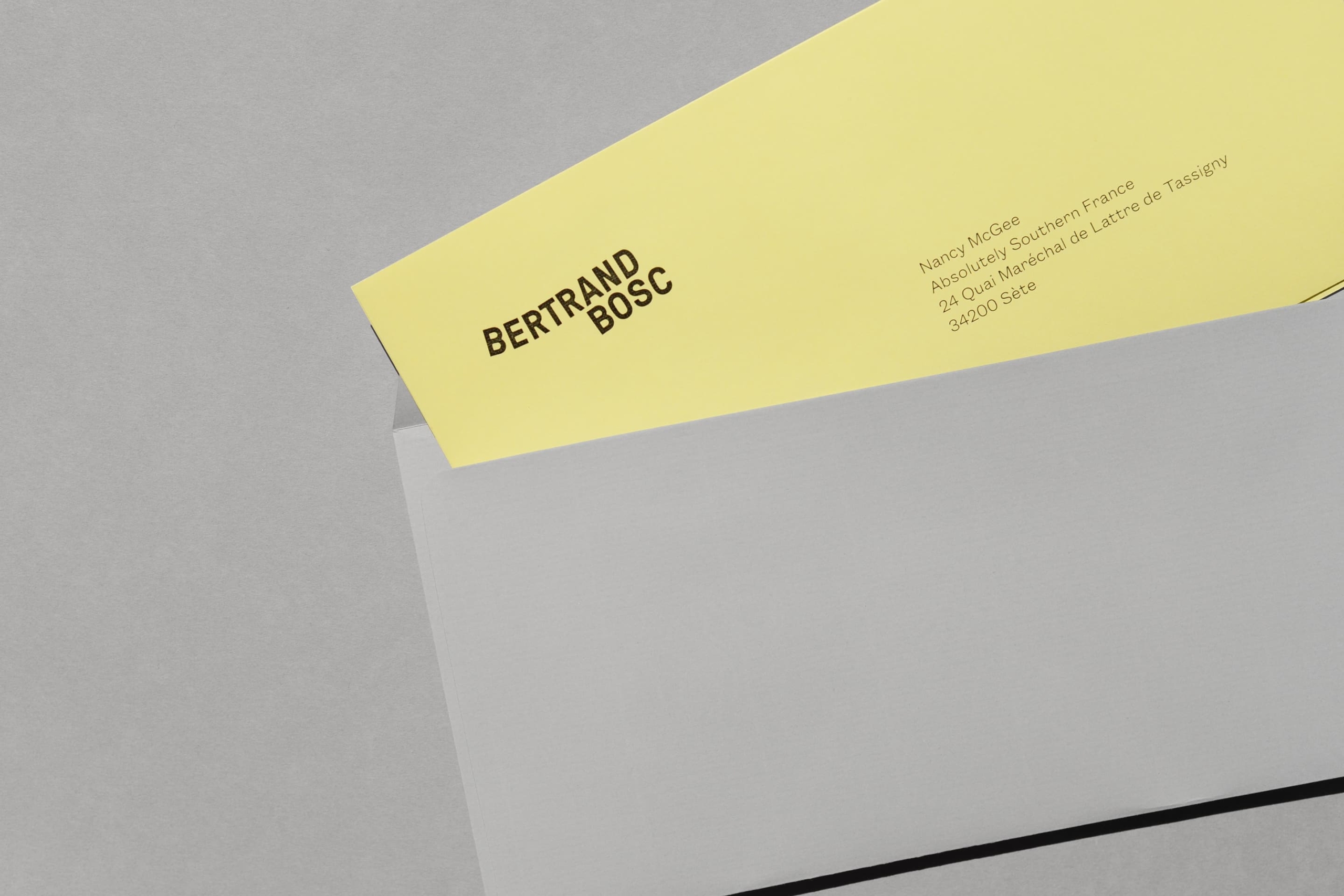
The identity is based on a solid color scheme imagined as an abstraction of vineyard landscape. This delicate chromatic range stands on all media to depict the atmosphere of the walks in the vineyards.
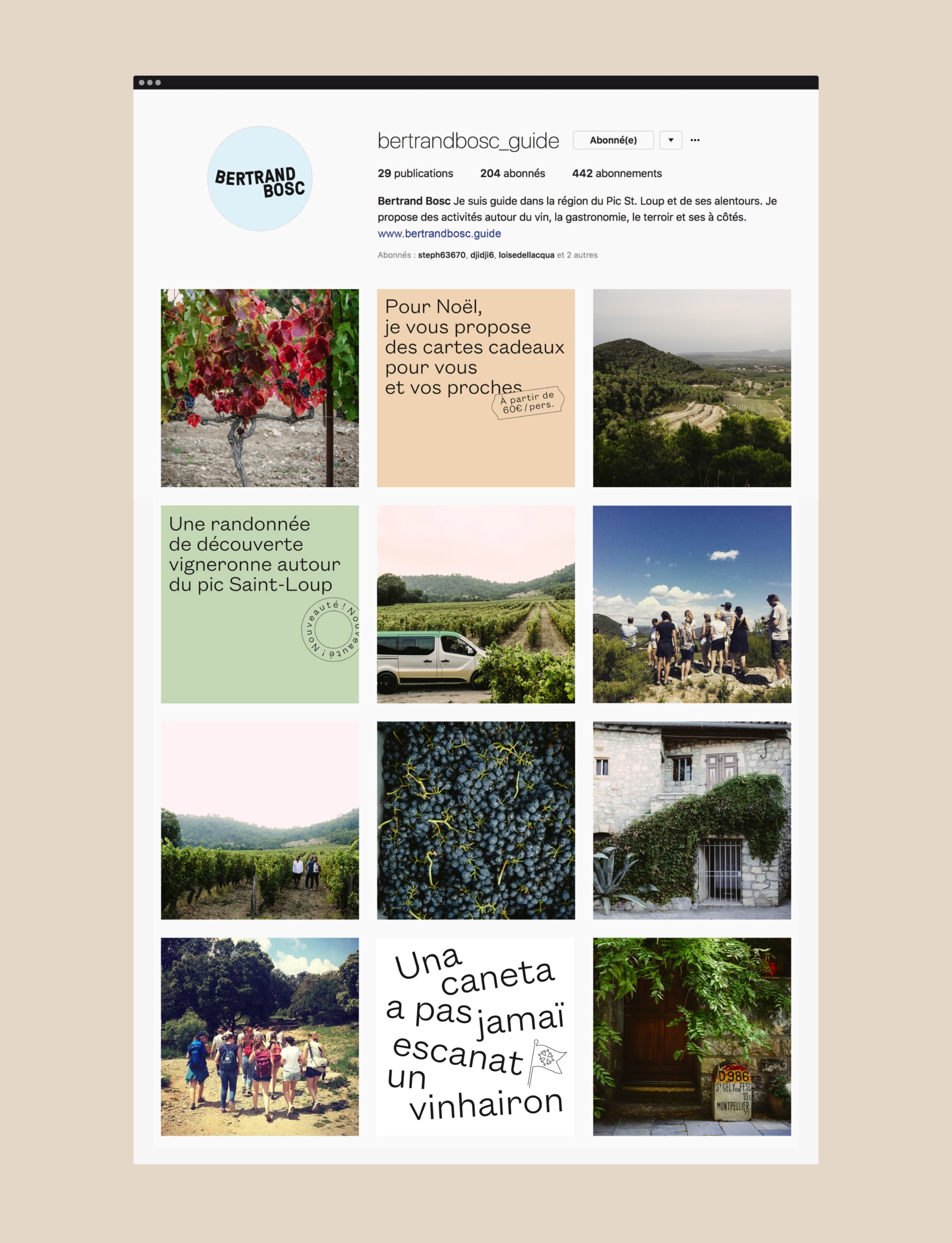
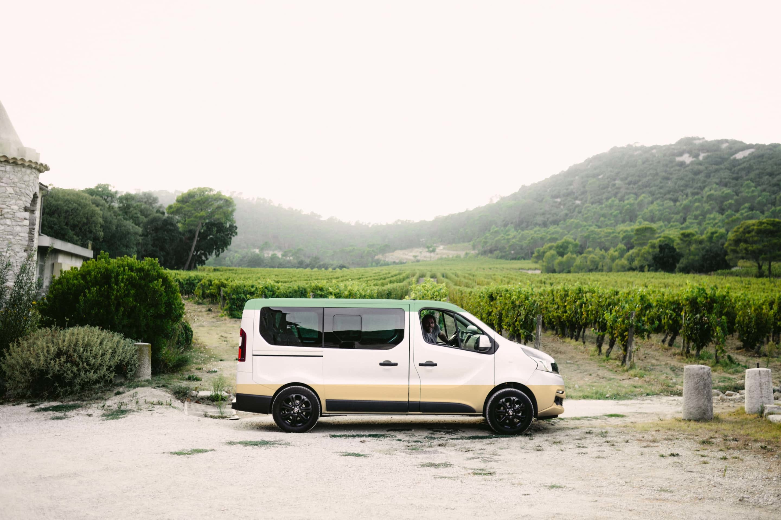
The logo is played as a signature for the closeness that Bertrand cultivates with his clients. Founders Grotesk and GT Pressura typefaces dress a sensitive and unadorned speech with gentleness and simplicity.
Credits
Copywriting: Olivier Talbot
Photography: Melissa Lenoir, Laurent Vilarem
Typefaces: Founders Grotesk, GT Pressura
Paper: G.F.Smith Colorplan
Letterpress: Bouquet Crozat
